If you have been following my travels over the past few years, it is no secret that I love going to Pennsylvania for short overnight trips or small vacations. There is just something about Pennsylvania I love and it always seems to just help me recharge the batteries. Lately, life has been very crazy and I decided it was time to do another short vacation to recharge. Join me as I take you along on my recent trip to Doylestown, PA for some fun explorations, sites and of course a hotel review!
Day 1 – Peddler’s Village:
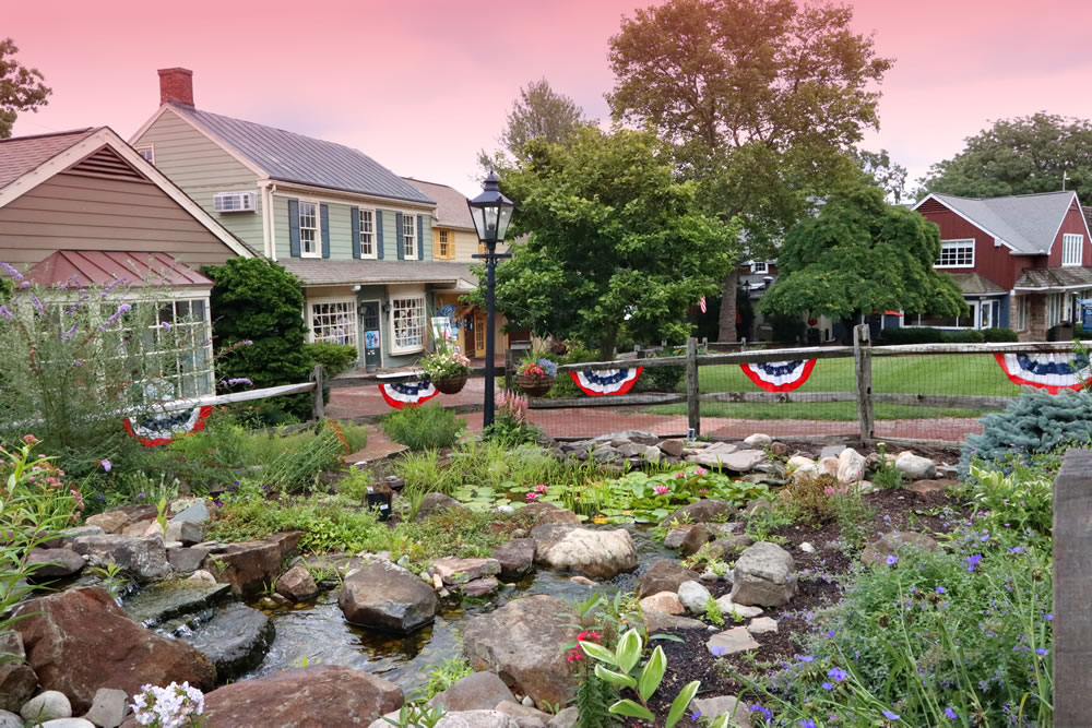
The first stop on our trip was Peddlers Village in the small town of Lahaska, PA. Peddler’s Village is a 42-acre countryside property that features 60+ retail shops and boutiques, full and quick-service restaurants, a 66-room hotel and an indoor family entertainment center.
Peddlers Village is so large, I actually ended up spending the entire day there with my family and got to visit most of the stores in the village. I loved the amount of variety and different types of stores there was. While visiting, we also got to do a few of the antique stores across the street from the village.
One of my favorite stores I visited here was Fehrenbach Black Forest Cuckoo Clocks and German Gifts. I was so excited to visit this store and couldn’t wait all morning during the drive out. This split 3 level store features German food specialties, handcrafted gifts from wood carvings, cuckoo clocks, nutcrackers and smokers. This was honestly such a cool store and it really felt like you were in Germany. I was honestly amazed at the cuckoo clocks with how intricate and detailed they were. From little birds popping out to entire groups of people dancing, it was amazing to see how much effort went into that and the end result. Of course I could not leave here without buying a cuckoo clock for myself. Best purchase this entire trip!
Overall, this was a great stop on the way out to Doylestown and was so much fun. I highly recommend this as a day trip or stop next time you are in Pennsylvania. If I ever got the chance, I definitely would stop here again.
Days 2 & 3 – Fonthill Castle & Mercer Museum:
Up next, our trip took us to two of the coolest places I have ever been to in Pennsylvania: The Mercer Museum and Fonthill Castle. Both of these places have some really cool history to them with rich histories tied to their creator, Henry Chapman Mercer, an early 20th-century antiquarian, archaeologist, and philanthropist. Mr. Mercer was very interested in preserving local history for generations to come and sought to do with his museum and Fonthill castle which was built as his residence. Up first, let’s explore the history of Fonthill Castle and showcase the stunning architecture and design of the home.
Fonthill Castle

Fonthill Castle was built between 1908 and 1912 using reinforced concrete which at the time was a new building technique. The castle was modeled after European castles with influences from medieval, Gothic, and other architectural styles.
The castle contains 44 rooms, with various levels, staircases, galleries, and hidden spaces. The rooms include living areas, galleries for his tile collection, a library, and even a small chapel. Mercer’s love for the eclectic and unusual is evident throughout the castle, which features asymmetrical design elements, circular staircases, and irregularly shaped rooms.
When you first enter the castle, you enter a dark circular room with arched columns that truely transports you back in time. You feel like you are entering a medieval castle straight out of a fantasy novel. As you navigate the castle further, each room gets more jaw dropping with its unique design, natural light and historic artifacts displayed and integrated throughout.
One of my favorite rooms was the library/study room with its floor to ceiling bookshelves, arched windows, grand fireplace and beautiful tile work. One of the coolest things is this room is two levels with the stairs cleverly tucked behind the fireplace giving the illusion there are no stairs to create a larger space. I found it amazing how old some of those books were in that library. Some were so old you could see the layers of dust through the sealed plastic covers that protected the books from disintegrating.


As the tour went on, it just kept getting more interesting and the rooms were getting more fascinating each with its own story and history. Yet another room that stuck out to me was the hallway area with “Rolo’s Stairs”. We learned from the tour guide, Mr. Mercer’s dog Rolo ran through wet cement at the foot of one of the staircases during construction. Rather than cover it, the paw prints were left and the staircase was named “Rolo’s Stairs”.
At the end of the tour, it felt as though you truly got a sense of who Mr. Merecer was the vision he had for his home. You were truly immersed in his story and it felt as though you knew him personally. I can’t recall many places that I left that evoked that feeling.
Mercer Museum:

If you thought Fonthill Castle was fantastic, you have to also check out the Mercer Museum. The Mercer Museum, completed in 1916, was designed to showcase his vast collection of over 40,000 American tools and historical artifacts, emphasizing the role of craftsmanship in early American life. The museum’s architectural style mirrors that of the castle, with a fortress-like design that houses exhibits on industrial and domestic tools, showcasing Mercer’s vision of preserving American history through its material culture.
I highly recommend Fonthill Castle and The Mercer Museum if you are ever in the area of Doylestown, PA. It is well worth the trip out here to be transported back into another time. You will leave appreciating the history and stories behind everything you will see just as Mr. Merecer wanted future generations to feel when he built both these stunning places.
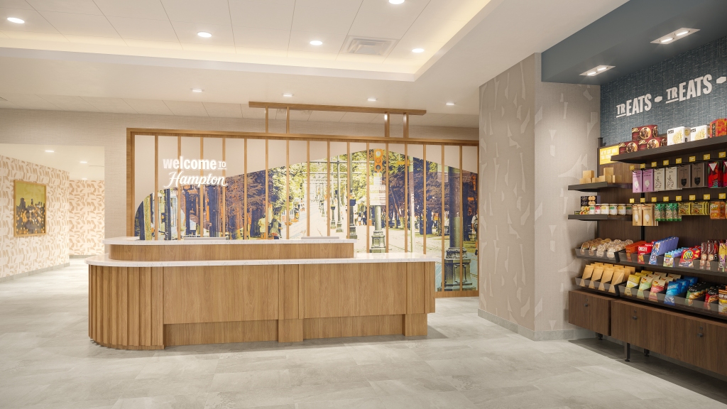
Holiday Inn Lansdale – Hatfield Review

Holiday Inn was honestly not my first choice of hotel since the last few IHG hotels I stayed at I was left disappointed with. However, with all other nearby hotels sold out or $300+ plus a night for the entire weekend, Holiday Inn became the best option available. The going rate was about $147 plus tax for each night which was honestly a steal.
One reason I picked this hotel was the fact it had very high ratings and was recently renovated. From doing some research, this hotel was built in 1970 which you can easily tell from the layout of the building and from older images of the hotel. The building is also sectioned off into A,B,C and D sections which is typical of older builds.
While I do not mind this unique design, I did find it annoying that there were no signs or directory signs to guide you to the elevators. The elevators are completely at the other end of the first floor and tucked around a corner making it hard to see from down the hall. There was also a small 5 step staircase that you had to go down to get to the 1st floor guest room hallway. If finding the elevator was not annoying as it was, the elevator took forever every time you called it. It took on average 3 minutes for the elevator to come each time which was annoying but not worth complaining over since it is not anyone’s fault the elevator is old. However, once I got the room, it was pretty worth the small inconveniences getting to the room.
Room Review – 3.4/5
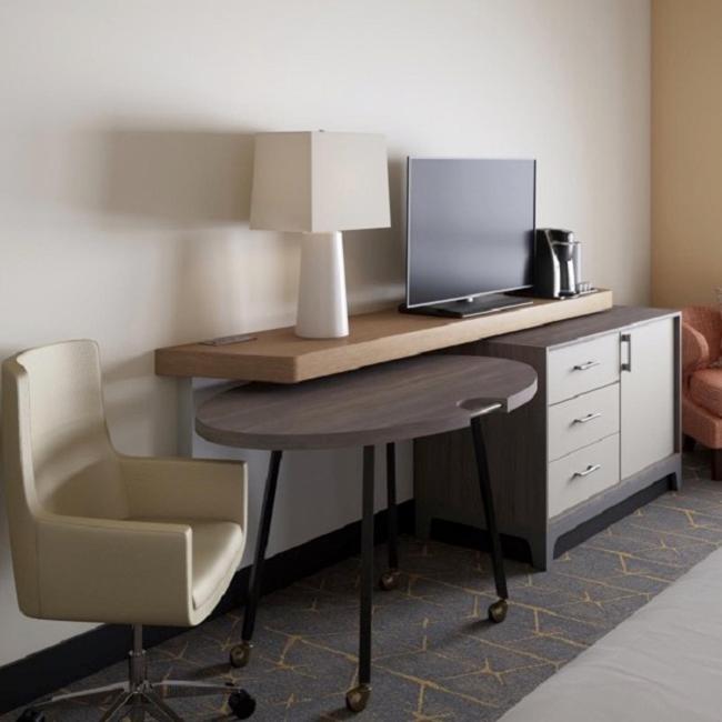
The room as mentioned, was newly renovated which you can tell since everything in the room looked brand new and was in excellent shape. When you first enter the room, you are greeted with a very spacious closet and wardrobe. I really enjoyed the amble storage and the fact there was a built in ledge with USB ports for phones and electronics. Very nice attention to detail there.

Before we get to the rest of the room, I want to mention the bathroom which honestly was the biggest downside to the room. While the bathroom was decently renovated, I noticed several issues that really made a difference. First off, the paint job on the ceiling and door was so sloppy and poorly done. You could see old paint chipping off the door, the ceiling hatch for plumbing access was painted over and it looks so tacky and bad.
The problems did not stop there sadly, the bathroom vent was clogged with so much dust that it kept falling into the shower despite trying cleaning it up several times. I have to say that is something housekeeping should have spotted. Other major issues of note include, very poor water pressure in the shower and at times a lack of hot water in the shower (temperature was more around room temperature or just barely warm). Last thing that was a major disappointment in the bathroom was how there was only one towel hook to hang up towels. I feel like this is a major detail missing especially for a room designed to sleep four people.

Other than the issues in the bathroom, the rest of the room was almost perfect. I was thoroughly impressed with the cleanliness of the room, the modern finishes and attention to detail throughout. Some key details that I loved were the AC filters being spotlessly clean with no dust or debris on them, the blackout shades were mounted inside the window frame so there is no annoying gap and the pillows were labeled if they were firm or soft.
Amenities – 3.5/5
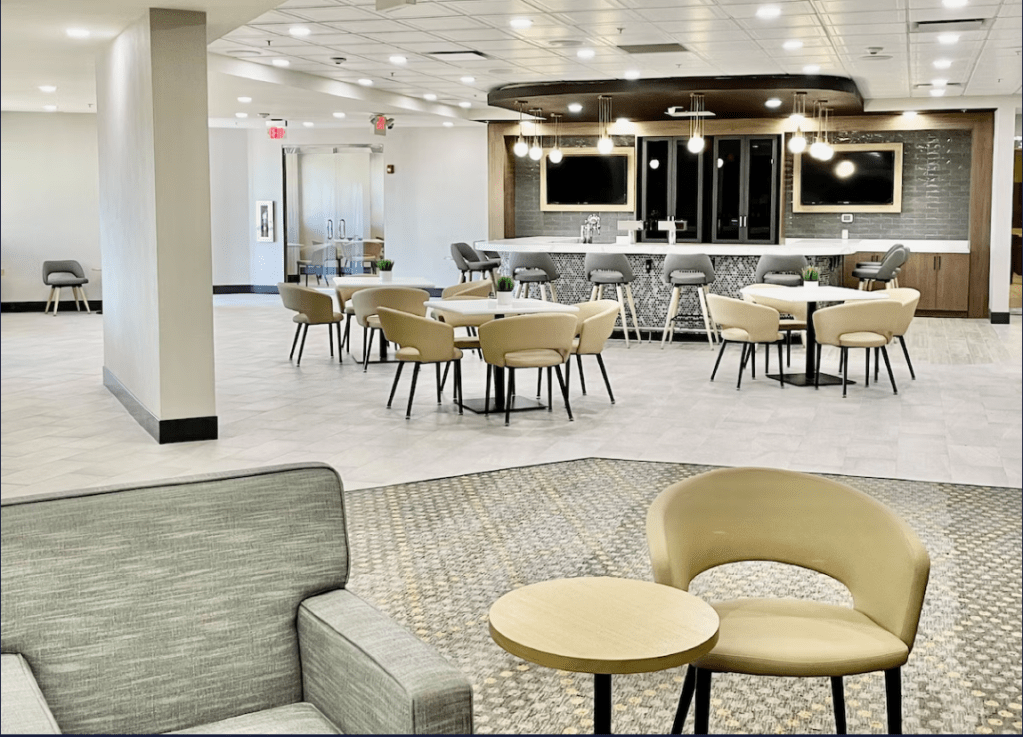
Since this was a full service Holiday Inn, it featured a lobby restaurant with a bar and a breakfast buffet. One major downside is breakfast was not included with your stay which would normally not be a big deal if you were paying for a really good breakfast. Unfortunately, the $14 was not worth it and you were essentially paying for a Holiday Inn Express type breakfast. I do not think a breakfast you would get at an Express location or any other select service hotel is worth $14.
On the flip side, the lobby restaurant and bar, while decent, was somewhat of a let down with an overly basic menu and not much selection. However, I do have to say the food they did have was pretty good but felt expensive for what it was. I really would have liked to have seen some sort of specials menu or seasonal menu to compliment the small menu.
Final Rating
So, where exactly does this hotel rate with all the pros and cons? Based on my experiences, I would rate this hotel 3.5/5. While I did have issues with this hotel, I would stay here again if the need arose and would most likely recommend this hotel.
Final Thoughts:
Overall, the trip was a major success and an absolute blast up to this point. However, it was far from over! We had so much fun that we decided to stay an additional night to explore more of what Doylestown had to offer and tour yet another one of the coolest historical places I have ever been to on this trip.
Stay tuned for part two where we discover Downtown Doylestown, Bethlehem Steel Works and another hotel review!