Better Late Than Ever? Choice Hotels Finally Revamps Comfort Inn and Country Inn & Suites

If you’ve ever road-tripped through America or searched for a basic, affordable hotel, chances are you’ve come across a Comfort Inn. And if you’ve ever stayed at one, you might understand why I never have. 

Like many others, I too always felt that Comfort Inns were stuck in the past. Dated rooms, inconsistent service, and a lack of basic amenities made these properties feel more like a blast from the past than a modern stay. For years, while hotel giants like Hilton, Marriott, and IHG aggressively refreshed their brands and raised standards, Choice Hotels seemed to be coasting on autopilot.

That finally seems to be changing for the better. Now sit back and come along as I take you through all the changes Comfort Inn and Country Inn & Suites are going through to become the hotel chains they deserve to be.

A Long Overdue Refresh

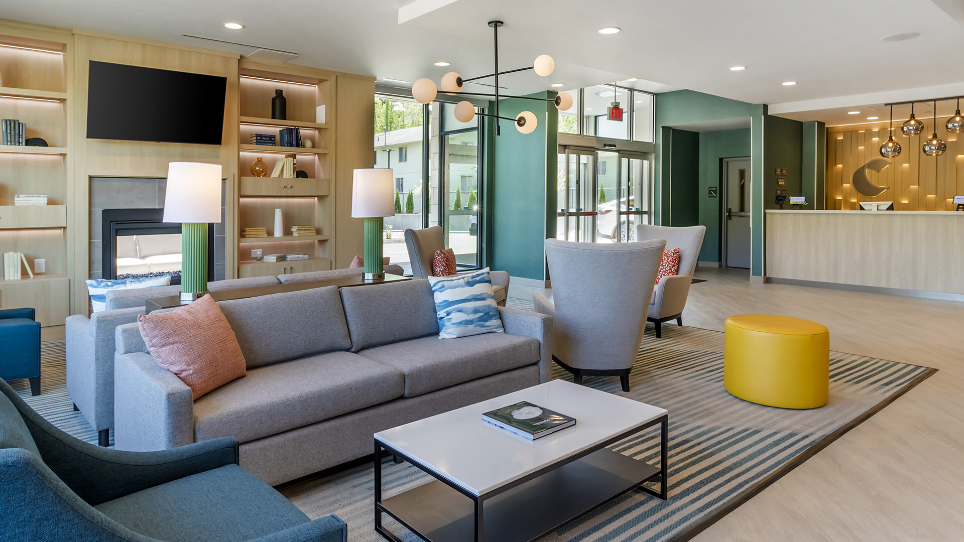
In 2021, Choice Hotels unveiled the Comfort Rise & Shine prototype, marking a significant milestone for its flagship brand as it celebrated its 40th anniversary. This new design aimed to modernize the Comfort brand and position it for continued growth in the upper midscale segment.

It is very clear that attention was paid to every single detail from day to day operations, franchisee feedback and most importantly the guests experience. The new design makes the best of both worlds for both franchise owners and guests. 

Key features of the Rise & Shine prototype include:

  • Reducing the average square footage of newly built hotels by an average of 3,000 to 4,000 square feet.
  • New guest spaces and that allow for flexibility and new revenue opportunities.
    • Examples include new outdoor porches and multi-purpose flex rooms that easily transform from additional breakfast space to meeting and event space.
  • Easily adaptable designs to allow for customization based upon geographic location and to fit the needs of the local market.
    • City (bold yet approachable with rich wood tones), Sea (calm and soothing with muted colors and light wood tones), and Sun (vibrant and cheerful with a relaxed yet optimistic
  • Outdoor patios anchored by an indoor/outdoor fireplace, open and airy public spaces with high ceilings and floor-to-ceiling windows to maximize natural lighting, and guest rooms featuring upgraded fixtures and furniture, including semi-open closets and new “on the go” stations at the door.
  • Empehis on better and more comfortable lighting throughout interior and exterior spades.
    • Examples include the front desk welcome wall, public space millwork shelving, exclusive up-lighting on the guest room headboard wall and media panel, and on the prototype exterior.

As Megan Brumagim, Vice President of Brand Management, Design, and Compliance at Choice Hotels, stated, 

“The prototype combines the features, design, and amenities that guests want, with the efficiency, functionality, and flexibility that developers expect. It offers spaces that can transform from day to night and serve a broad range of guest stays, whether business or leisure.”

So far, the new The Rise & Shine prototype has been adopted in over 140 properties across the U.S., including locations in Nashville, Huntsville, and Fort Myers. These updates have led to increased guest satisfaction scores compared to previous designs. Additionally, the updated design package has resulted in a 16% average cost optimization for owners, achieved through smart, innovative design and partnerships.

Country Inn & Suites: A Fresh Take on Generous Hospitality

Comfort Inn is not the only brand getting a major retool and refresh. Following Choice Hotels’ acquisition of Radisson Hotels Americas in 2022, the company has made significant strides in revitalizing the Country Inn & Suites by Radisson brand. (If you are interested in learning more about this acquisition, check out our post: Choice Hotels Acquires Radisson Hotel Group Americas – Thoughts & Reactions)

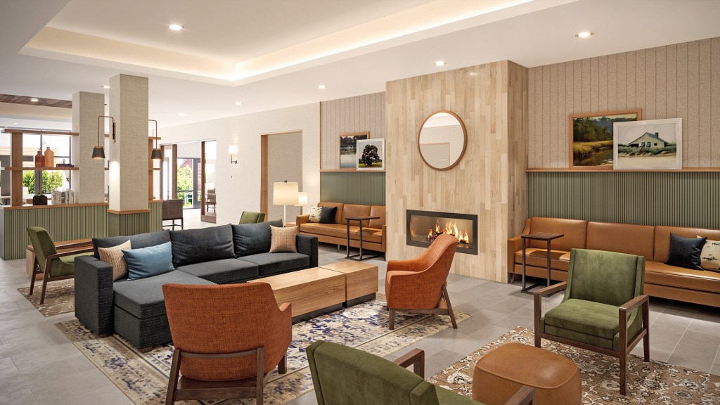
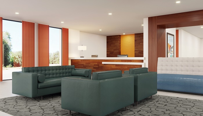
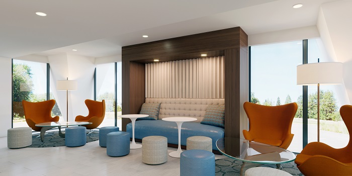
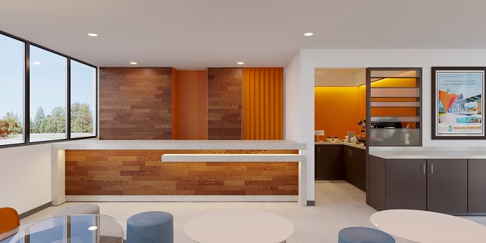
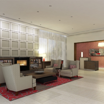
The refreshed prototype emphasizes a philosophy of generous hospitality, appealing to guests who value a comfortable, relaxed environment with a residential ambiance.

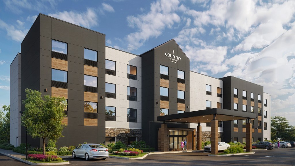
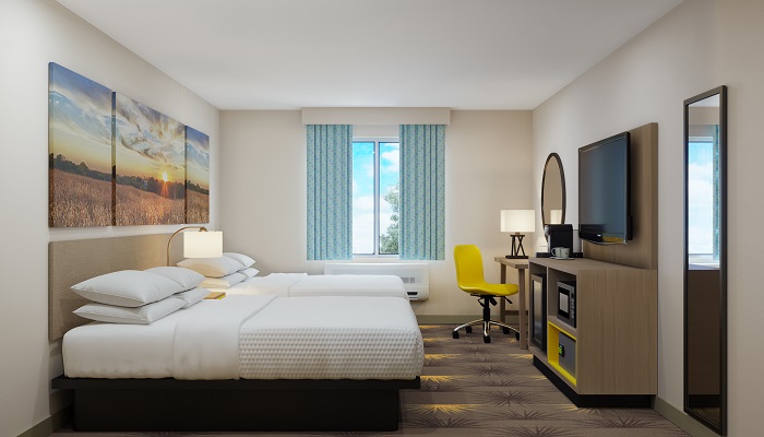
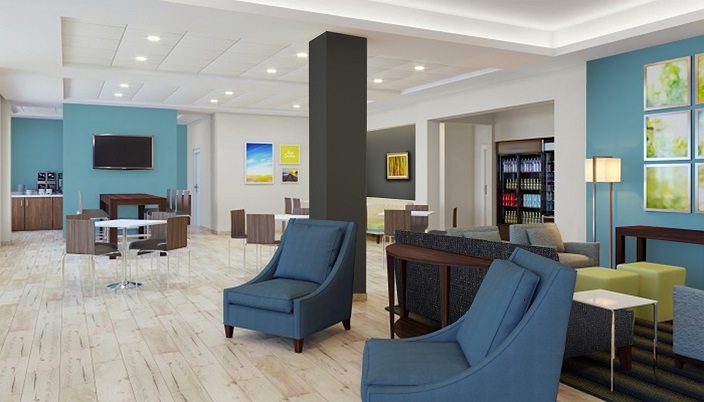
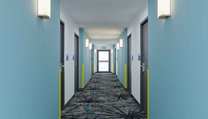
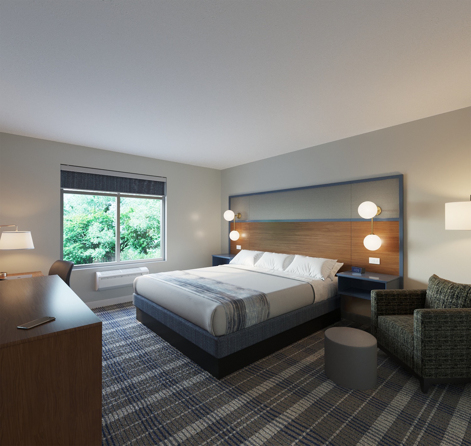
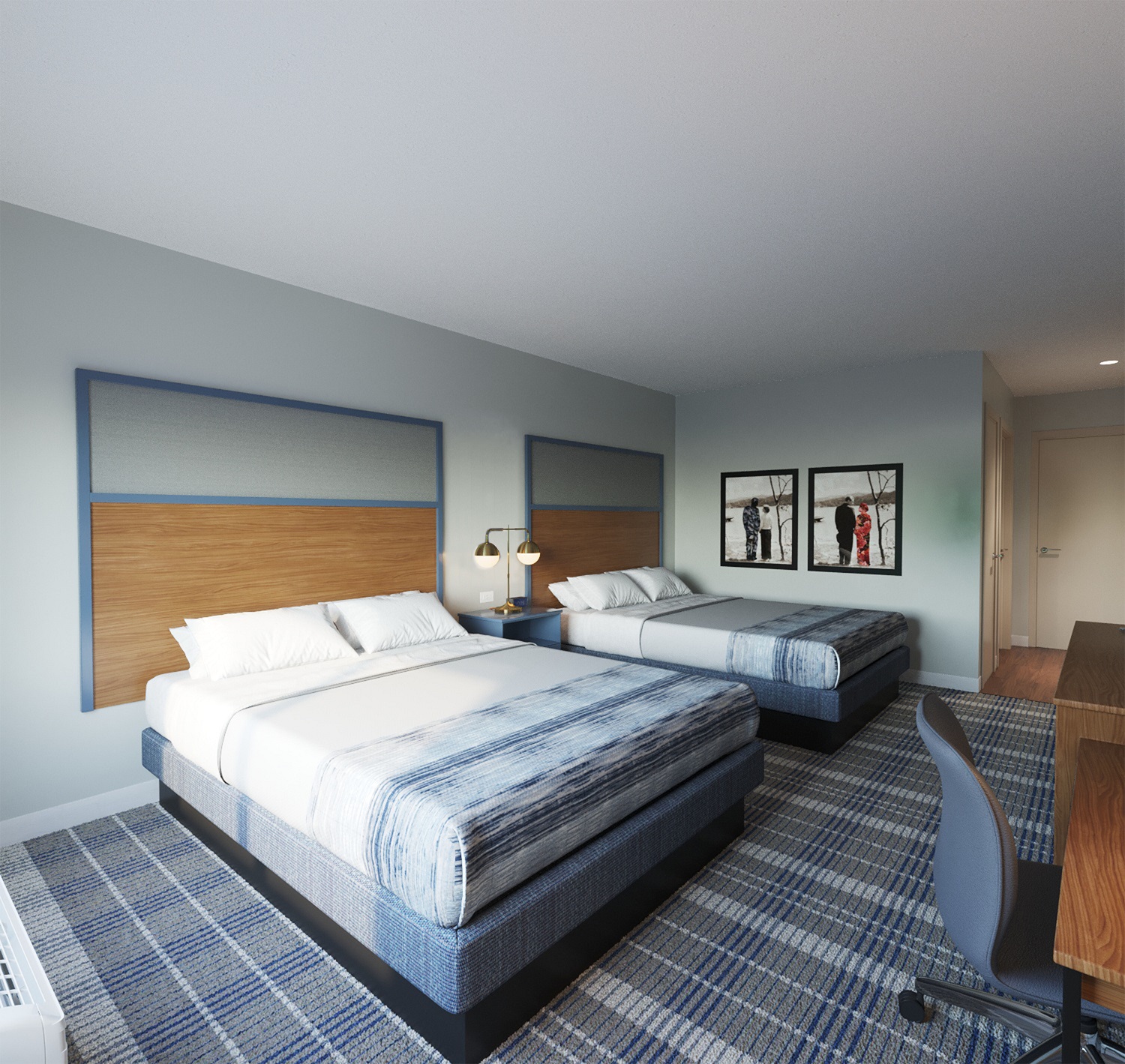
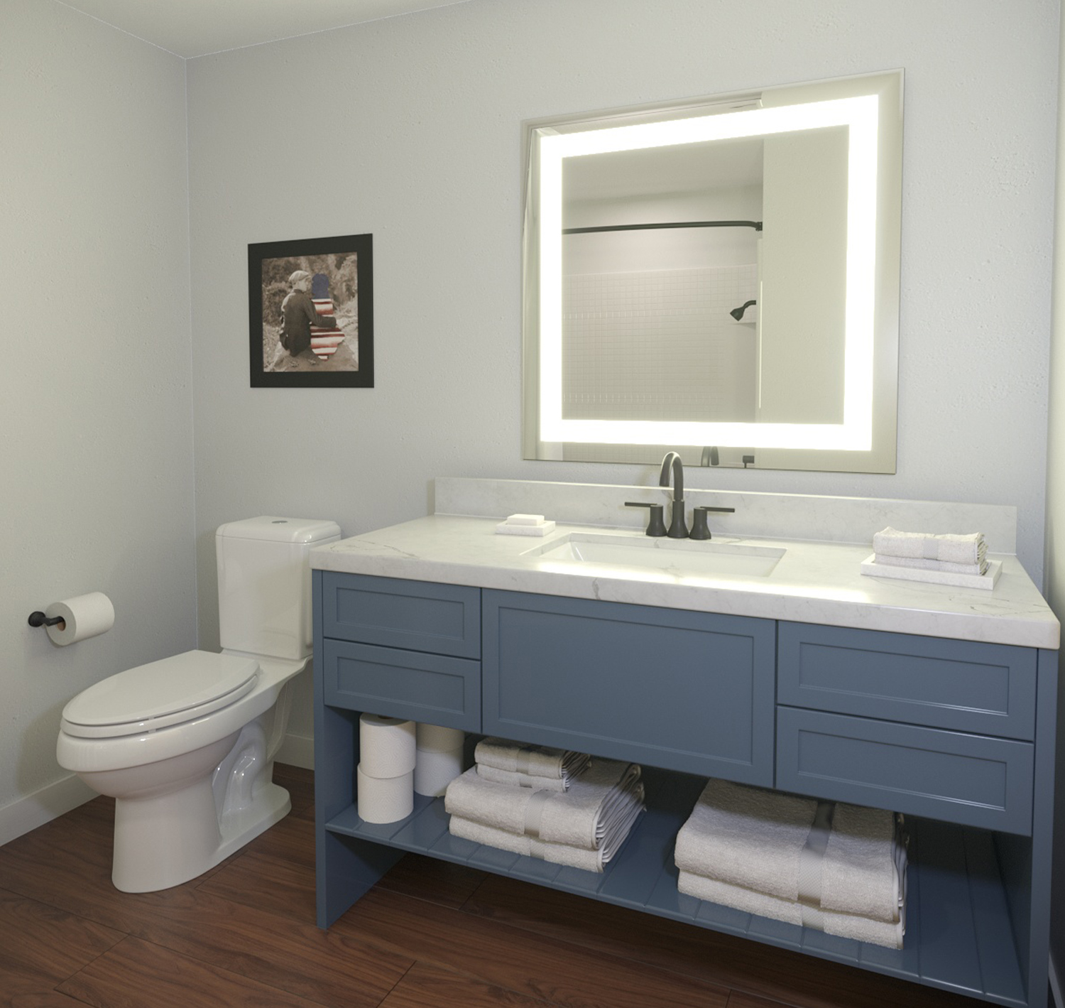
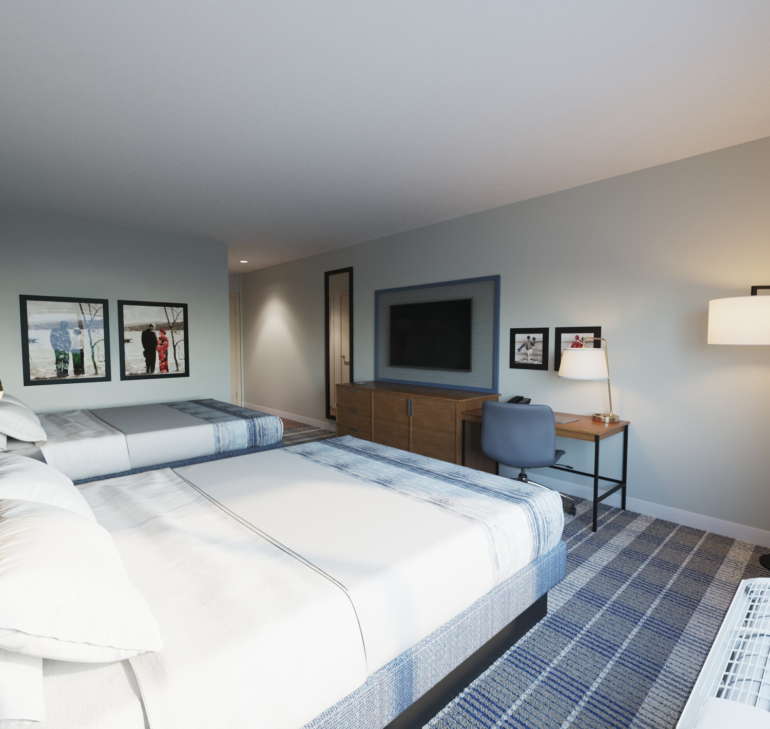
Unfortunately, there is not many renderings or images available for the prototype nor could I find any official confirmation of any locations using the new design. The only information that I could reliably find was directly from the Choice Hotels website which is where I find the renderings below:

Key updates include:

  • Similar to what we have seen with the Comfort Inn upgrades, the Country Inn & Suites also optimized their layout and square footage required for new hotels built. During this process, the prototype gained enough space for 18 keys (rooms).
  • Reduced costs for owners and operators while maintaining the rich legacy of Country Inn & Suites.
  • Guests are now greeted with a signature freshly baked chocolate chip cookie and can unwind in cozy public spaces designed with a residential ambiance, including a well-scaled single-story connected lobby and dining space.

The results speak for themselves in a positive way with higher reported revenue, more direct bookings and a higher growth in business travel. Furthermore based on guest surveys done, 84% of guests reported they would likely stay at a Country Inn & Suites hotel following the design refresh.

Why Now?

Frankly, this move was necessary years ago. I mentioned this same issue in my blog post on Wyndham’s new prototypes: many economy and midscale hotel brands lost appeal over the last decade because their parent companies fell behind on innovation. While Hilton and Marriott were rolling out new flagships and modernizing legacy brands, Choice and Wyndham moved much slower.

That said, Choice wasn’t completely idle. While Wyndham largely maintained the status quo, Choice at least took some strategic steps launching new brands like Everhome Suites and acquiring Radisson Americas, which included the Country Inn & Suites brand. Still, the flagship Comfort Inn brand continued to lag in perception.

The reality is that Comfort Inns across the country became wildly inconsistent. Some locations are clean and decently maintained; others feel like stepping into a time capsule. That inconsistency is a byproduct of franchise-heavy models where enforcement of brand standards can be lax.

However, this seems to be the first step forward to changing this long standing issue for Comfort Inn. The new design looks fresh and is ready to compete with other budget chains and even the big players like Hilton or Marriott. However though, without continuous brand enforcement or regular investment in property improvements, even a great prototype can fall flat once rolled out.

Can It Make a Difference?

It’s encouraging to see Choice Hotels investing in its core brands, even if it feels a little late. There’s clear intention here not only with fresh designs but also in the language they’re using. The new branding is more than a logo swap; it’s about “sharpened identities” and modern guest experiences.

Will it work? That depends on execution. If franchisees adopt the new prototype widely and Choice commits to stronger brand enforcement, it could help repair Comfort’s reputation and make it a serious contender in the midscale space once again.

For now, it’s a step in the right direction and one that’s been a long time coming.

Holiday Inn Express European Redesign – Ugliest Hotel Design Ever?

The headlines have been busy these first few months of 2025 with yet another major player in the hotel scene making an announcement on new developments. In a recent press release, IHG Hotels & Resorts introduced the future-ready Generation 5 concept for Holiday Inn Express, set to revolutionize its public spaces across Europe, the Middle East, Asia, and Africa (EMEAA).

Before we get into my personal thoughts and reactions, let’s dive into a brief recap of what Generation 5 is all about.

Future Ready – Generation 5

It is clear the focuses on the new design are all centered around guest experience, diversity and inclusivity. The Generation 5 design reflects insights from extensive research into traveler preferences, including the demand for experiential and sensorial spaces. With zones like the EXPRESS Café & Bar and Focus Studio, guests can socialize, relax, or work in vibrant settings tailored to their lifestyles. Smart guest room features, such as ergonomic workspaces, ample USB ports, and Smart TVs, complement the elevated public spaces.

Each hotel will incorporate elements that reflect its local destination, ensuring a distinct sense of place. Moreover, IHG collaborated with a disability task force to create public spaces that are inclusive and accessible, catering to diverse needs and fostering a welcoming environment for all.

The Generation 5 design also focuses on offering flexibility and cost-effectiveness for hotel owners. Its scalable layout allows for easy adaptation across different locations while keeping costs manageable. This ensures that owners can maintain strong financial returns without sacrificing the high-quality standards Holiday Inn Express is known for.

When asked about his thoughts on the new design, John Wright, Vice President of Mainstream Brands for EMEAA at IHG had this to say:

 “Generation 5 is a premium, vibrant, and dynamic design that leans into a lifestyle vibe that’s on trend. It’s playful and distinctive nature defines the witty personality of Holiday Inn Express, while its flexibility ensures each hotel reflects a sense of place.”

Generation 4 vs Generation 5:

Holiday Inn Express first introduced its Generation 4 design in 2016, focusing on modernizing guest rooms and public spaces with smarter layouts, improved service delivery, and enhanced technology. While it set a new standard for efficiency and comfort, Generation 5 takes things a step further by creating more dynamic, flexible, and experiential public spaces that cater to evolving traveler expectations.

Here’s how Generation 5 builds upon and improves the previous design:

  • More Experiential Spaces – Generation 5 introduces zoned public areas like the EXPRESS Café & Bar and Focus Studio, designed for socializing, working, and relaxing. Generation 4 emphasized functionality, but the new design brings a more vibrant, lifestyle-focused atmosphere.
  • Greater Flexibility – The new design allows hotel owners to adapt and scale spaces based on location and market needs while remaining cost-effective. Generation 4 was more standardized, whereas Generation 5 offers more local character and customization.
  • Enhanced Guest Engagement – Research shows travelers today want spaces that encourage connection and comfort. Generation 5 delivers this through inspiring aesthetics, multi-use furniture, and tech-forward features, making public areas feel more inviting.
  • Stronger Sense of Place – Unlike Generation 4, which had a uniform look, Generation 5 embraces local design elements, giving each hotel a unique identity while staying true to the Holiday Inn Express brand.
  • Inclusivity & Accessibility – Generation 5 was developed with insights from a disability task force, ensuring public spaces are more accessible and easier to navigate for all guests.

While Generation 4 modernized the Holiday Inn Express experience, Generation 5 reinvented it to deliver a smarter, more engaging, and future-ready hotel stay.

Examples of Generation 4 designs throughout Europe.

Deep Dive Into Generation 5 – Thoughts

Being brutally honest, this has to be one of the ugliest and most awful hotel designs I have ever seen. It looks like one of those really cheap and tacky home decor stores filled with cheap stuff that is “modern.” Look, I totally understand that outside of North America, there are different markets, each with its own specific demographics or preferences suited to that market. But this is just honestly bad.

I feel as though the thought process behind it is good, but the execution is very poor. From looking at some of the concept art, it makes the hotel look more like an elementary school or preschool than a hotel. At least with the previous generation, when it added in bold splashes of color, natural tones, and more of an artistic flair, it looked more like a hotel and was well done. I think there needs to be evolution and adaptation, but I don’t think this is the way to go.

I am all for making hotels not so cookie-cutter, but at the same time, I feel like as a brand, there needs to be some standardization and not too much deviation from the brand. It feels like Holiday Inn Express is trying to be something that it is not. It feels like they are trying to be more like a lifestyle hotel brand like Moxy, where they focus heavily on community, local design, and communal spaces.

To be very clear, I am in no way at all knocking this design because it was designed with inclusiveness and accessibility in mind. I am more critiquing and criticizing the actual design, such as furniture, color, and décor choices. I am all for designing spaces that work for everyone, but I think the final product just doesn’t look good like how you would expect from a Holiday Inn Express.

Final Thoughts

While the Generation 5 concept aims to offer innovative spaces that cater to modern traveler needs, the execution raises questions about the balance between creativity and brand identity. As the hospitality landscape continues to evolve, it’s crucial for brands like Holiday Inn Express to adapt while still maintaining the core essence that guests expect.

Ultimately, design should evoke a sense of comfort and familiarity, serving not only to attract new customers but also to reassure loyal patrons. The future of travel accommodation lies in thoughtful integration of local flair with brand consistency and guest-centric approaches. As we move forward, it will be interesting to see how this new design is received by travelers and how it influences the broader hotel industry. Only time will tell if Generation 5 can truly redefine what a Holiday Inn Express should embody.

Stay tuned for the first look at Holiday Inn Express Generation 5 when it opens in 2026!

Hampton Inn Redesign: Revitalizing Brand Identity and Guest Spaces

If you have been following along with my Touristician Reviews series where I recap my travels, you may have noticed a recent trend in my hotel recaps. Almost every time I travel somewhere whether it was to Detroit, Richmond, or Lancaster County, I always stayed at a Hilton branded hotel such as Tru, Hampton Inn, and Home2 Suites. In general when I travel, I always look for a Hilton branded hotel as it is always reliable, consistent, comfortable and clean. 

So when I found out one of my favorite Hilton brands, Hampton Inn is getting a refresh, I knew I had to take a look at the design. In this post, I will be going over the redesign, comparing it to the current prototype Hilton and sharing some of my thoughts on the new branding and design. So without further ado, let’s dive in!

© 2024 Hilton

Hampton Press Release:

Going through the press release, we can see there are a few key points Hilton is aiming towards with this branding update. Those being:

  1. Refreshed brand identity with an updated logo, new branding, and focusing on what makes Hampton unique as a brand.
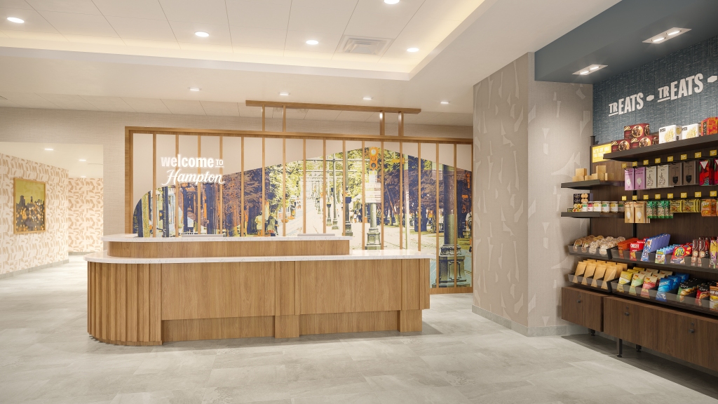
  2. Redesigned guest spaces and a move away from a traditional lobby set up allowing for more spacious and open room design.
  3. New guest rooms with a focus on utilizing space and decluttering rooms by using less furniture pieces.
  4. Emphasis on smarter more efficient design allowing for operational efficiency and cost savings for operators. 
  5. Keeping the well known and loved exterior design only slightly tweaking the colors, finally adding outdoor space and modifying the entryway.

Initial Thoughts

Overall, I love how they kept the existing exterior design they have and just added to it. Although nothing is ever going to replace the traditional exterior design. I really love how they added an outdoor patio space to the design as this is something I noticed Hampton has been lacking for a while. When I stay at Home2 Suites or Tru I love the outdoor spaces they have, especially at night for relaxation just before bed. Although, I’m not sure if it is just the way the concept art shows it, but I think it is odd how the patio is literally next to the front door where cars pull up. I personally would rather see it moved to the back of the hotel away from the front entry like how Tru is. That or I’d like to see some more separation. However, I do recognize this concept art and the actual prototype may vary once it is rolled out.

Moving on to the lobby, I personally have mixed feelings about this design. I like how the retail market is moved out and is not stuffed in a corner or buried in the lobby. I feel like this helps contribute to that open air, large space design Hampton wants. One thing I dislike though is the seating area/community area. I feel like the furniture gives the space a dated feel and doesn’t really remind me of how a Hampton would be. Again I get this is just concept art, so we’ll have to just see how this actually turns out when the first location using this design opens.

Looking at the front desk, I like how it is not a cramped work space and has branding behind it. Although, I do have to say I wish they stuck more with the little greeting phrases on the walls they use now like “Welcome to the Garden State” or “Welcome to the BuckEye State”. I do have to give the design props though cause they did somewhat incorporate that in the foyer as we saw from the video. Personally, I’m not a fan of how lite the wood tones are since I feel like they clash with the darker wallpaper accents. I’d much rather see more of a walnut or brown toned wood instead since I feel like that is more consistent with the current new builds and design that is currently rolled out.

New welcome wall at foyer entrances in the new prototype design.

Room wise, I have mixed feelings and a few concerns with the new prototype. This redesign is meant to fit more rooms within the existing blueprints for new builds which means smaller room design. This concerns me as I do not want to see room sizes similar to Tru being implemented. Generally if I am only doing an overnight or two nights, I prefer Tru since it is a smaller room and generally I am just looking for a comfortable place to sleep without fuss. However, when I look to book a Hampton, generally it is for multiple nights so I prefer a little more space and do not want as small of a room. I’m personally not a fan of this design for a variety of reasons:

  1. Lack of a closet space. I totally understand wanting to open up the space to make it feel less cramped but I dislike not having a closet. While I like this closet set up for a Tru, I feel like it doesn’t fit as well with the Hampton design and will be a move away from what Hampton rooms are known for.
  2. I’m personally not a fan of the light wood tones since I feel like they clash with the color scheme of the room. I like the colors of the room since I feel like those are classic Hampton colors but the furniture just feels out of place to me. I personally would have the existing walnut colored furniture and fixtures in the room since I feel like they fit better and are already pretty streamlined. I feel like this furniture is too similar to that of Wyndham and it takes away from what makes Hampton Inn unique.

Another thing that alarms me, is in the press release, they mentioned a bathroom redesign. I surely hope they improve on the current bathroom design. Personally, I am sick and tired of seeing a lack of thought go into towel racks or towel hooks in hotel bathrooms. I personally like to sometimes reuse my towels for a few days before getting fresh ones. However, this is often complicated when there are only one or no hooks or towel bars. I would like to personally see sliding glass shower doors instead of curtains in the shower stall. I am starting to dislike shower curtains because you can’t tell if they are clean or how often it has been cleaned whereas with glass doors, you can actually see the steak marks and it is way easier to tell if it has been cleaned.

Current Vs New Branding & Design

Along with the refreshed hotel design comes the newly updated marketing and branding. I have to be honest here, and say I am thoroughly surprised and delighted with all the updates. Looking at the logo, I love how they kept the logo almost the same and added little touches like connecting the font together between the p and t and just modified the colors slightly. I was honestly nervous like most modern day rebranding, that the logo would be butchered and look so cooperate looking. However, this was definitely not the case here and I have to say Hilton hit it out of the park on this one.
The logo was not the only thing that received a much needed face lift. We also see the new branding and marketing materials that were a part of this brand refresh. I love how they kept those iconic mustache coffee cups and really took that idea and elevated it to the next level. I also love how they took the iconic waffle breakfast that the chain is known for and focused on that for billboard advertisements along major highways and high traffic areas.

When I was looking at all the new marketing materials, I noticed a few subtle things that stick out. First, when I was looking at the renderings for all the new promotional items, I see the Hampton Inn Memphis-Poplar is listed on the business card renderings. If you look up this location, it appears as though this location is due for a renovation. Is it possible the first roll out of this design would be in the Memphis-Poplar location?

Yet another thing that sticks out is in the newspaper ad rendering, you can briefly see a variation of the new design with a slightly different color scheme. Is it possible there are going to be variations to this new prototype design depending on the location of the hotel? Honestly speaking, I prefer the blue color scheme pictured since that feels more like Hampton Inn to me.

Final Thoughts:

Overall, I think these changes are mostly positive for guest experience and for operators to ease the burden in day to day operations. I can’t wait to see this new prototype rolled out and see the end result. I am never usually disappointed with Hilton branded hotels, and I can’t wait to stay in one of these new hotels one day. Personally, if I was ever to open my own hotel, this would be one of the brands I could consider going with based on my experiences, and my stays with Hampton Inn.

What are your thoughts on the new Hampton Inn redesign and updates? Let us know in the comments below. As always if you are enjoying our content be sure to subscribe and follow us on social media to never miss blog updates and any new posts. We’ll see you in the next one!

Get new content delivered directly to your inbox.

Wyndham Prototypes: Expectations vs. Reality

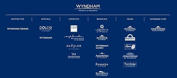
Wyndham Hotels & Resorts, Inc. is a hotel company headquartered in Parsippany, New Jersey. The company is known as the largest hotel franchiser in the world, with 9,280 locations across 22 unique brands. Some of those brands include the well established Howard Johnson, Days Inn, Ramada, Super 8, Travelodge, Baymont, La Quinta, and Wyndham. There is partially a brand for every market out there (economy, extended stay, full service, luxury, etc.)

So what’s the problem with Wyndham? Well, many of these brands are very established meaning many locations are very old, outdated and are becoming less appealing. Throughout the years as Hilton, Marriott, IGH and many others rolled out new designs, updated their brands and upped their standards, Wyndham just fell silent and kept on going. So, now many of these brands across the country are becoming less appealing due to this. Another reason for this is with these brands being franchises, it also means on top of being outdated, some locations aren’t run very well giving Wydnham a bad image. Lastly, the standards Wyndham has are very soft compared to what other companies have. They are jokingly called the “relaxed” hotel company which ties into the first point made above. 

All these factors give Wyndham a poor image. However, it is worth pointing out that not all locations or brands are terrible. It all boils down to the ownership and management at that particular location. Between 2018 and 2021, Wyndham finally woke up and came out with new concepts, updated designs and rolled out new standards. In today’s post we will be taking an in depth look into Wyndham Hotels & Resorts most recent brand prototypes and what the future holds for some of these brands. So without further ado, let’s jump into our first brand!

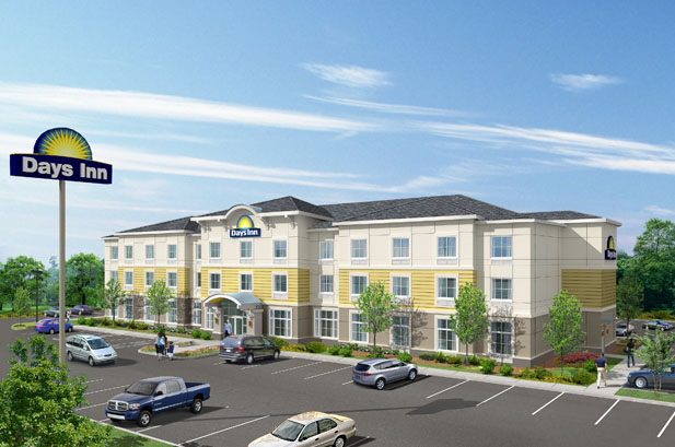
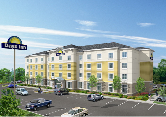
Days Inn – Bask in the Sun

The Days Inn brand was founded in 1970 by Cecil B. Day, who opened the first location in Tybee Island, Georgia. From the very start, this brand was innovative and creative with playing with new concepts and ideas. For example, when the second location was constructed, it featured a restaurant and gift shop combination called Tasty World. In addition to this, the hotel also had on-site gasoline pumps to sell unbranded fuel to motel guests. Days Inn was one of the first hotel chains to offer discounts to senior citizens. It was also among the first to locate its properties along suburban and rural exits on the Interstate Highway System, as opposed to more urban locations.

The brand is now a part of the Wyndham Hotels and Resorts, headquartered in Parsippany, New Jersey. As of December 31, 2018, Days Inn includes 1,728 locations worldwide with 137,678 rooms.

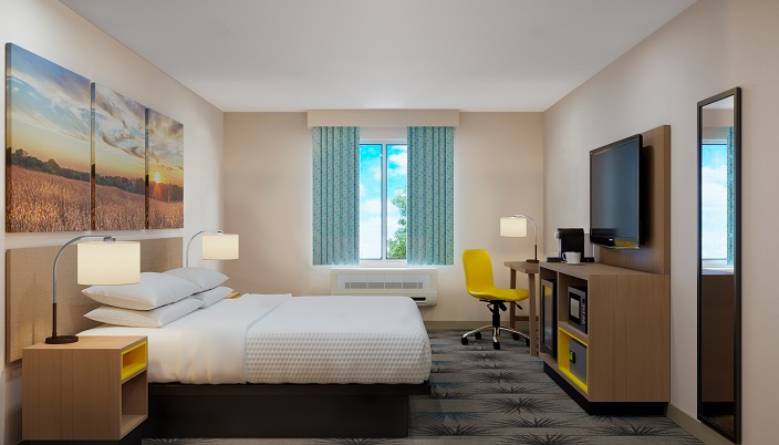
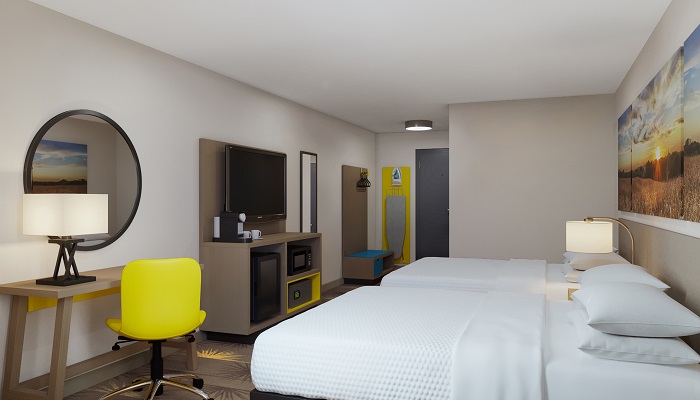
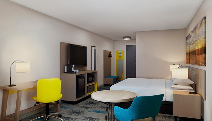
Throughout the years under Wyndham’s control this brand has fallen from its roots and just sat quite with no new room designs or innovations done. Pair this with very loose and poor quality control measures, the brand really has fallen to a cheap, hit or miss roadside motel brand. Finally, after many years in 2018, the brand announced it would be refreshing everything from room designs, branding and more.

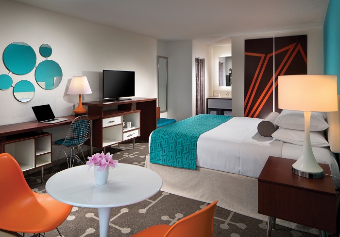
As someone who works for this brand, I have to say this new room design really excites me as it really embraces the original spirit of the brand and takes the color scheme of Days Inn and really builds on it. As someone really into marketing, I love when companies make subtle references to their brand by using their color scheme or logos in creative ways. I can definitely see, at least in my hotel, the rooms going for a higher rate once we roll out this design.

Howard Johnsons – Go Happy. Go Hojo.

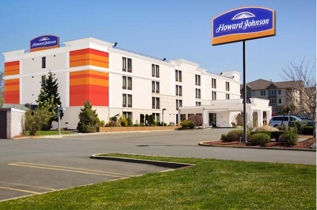
The history and story behind this brand is actually very interesting and a cool story to really take a look at. The Howard Johnson brand actually started as a chain of famous restaurants that were the first to sell 28 flavors of ice cream and create the classic diner experience we all enjoy today. Continuing to build on the very successful concept, Johnson began pairing new restaurant locations with lodging to target more travelers and families. 

Sadly, much like many of Wyndham’s economy or mid-tiered brands, this brand has also suffered the same fate of falling far from its roots and developing a poor brand image. Perfect example, the Howard Johnson location not far from my hotel I work at is notorious for police activity, drugs, prostitution, and other questionable activities. The hotel really is a hive for all these troublesome people and activities. However, just because this one location is like this doesn’t mean they are all exactly like this. My point is many of these locations suffer similar issues while some locations are much better off. It honestly all depends on the operators and owners of the property.

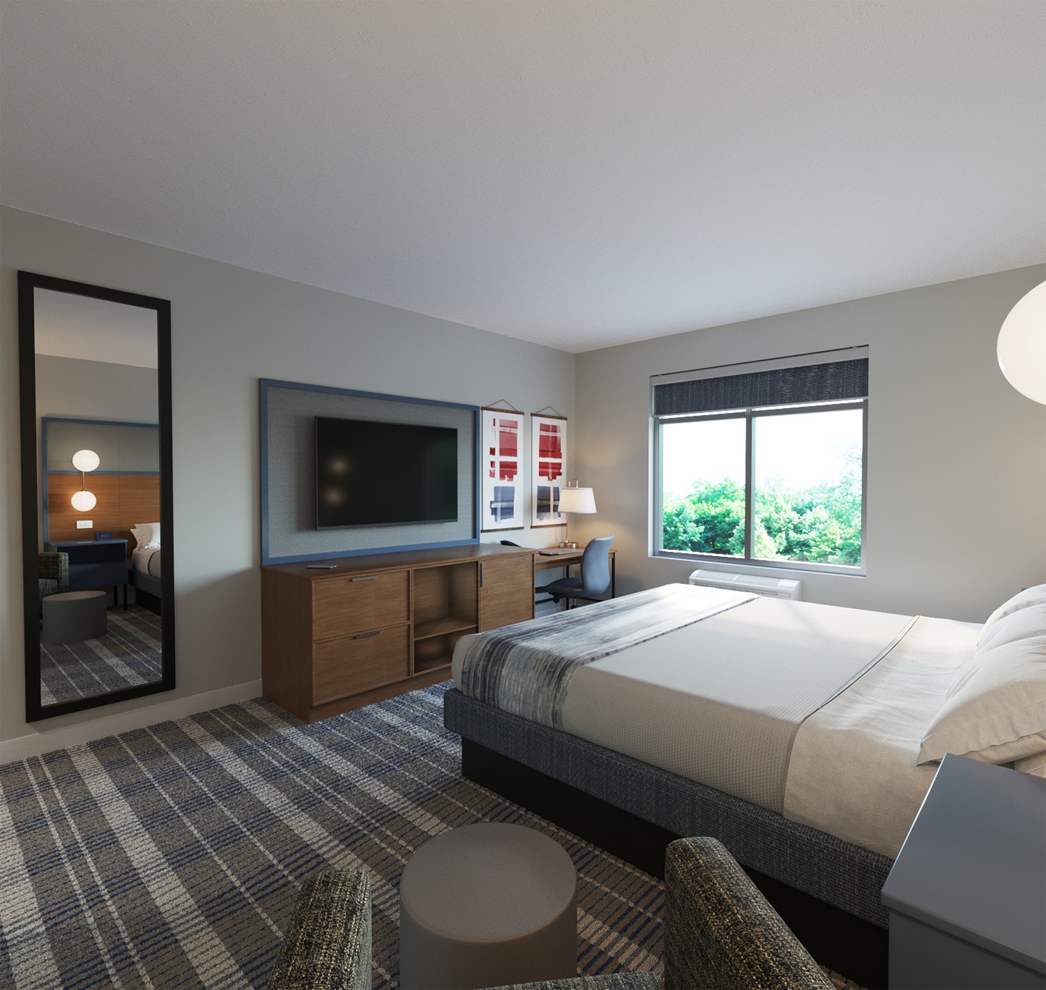
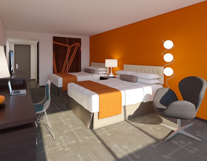
I have to say out of all the prototypes released, this is one of my favorites since it really takes the classic Howard Johnson style and brings it into the 21st century. It really reminds me of something you would see from HGTV or from one of those renovation shows. Like I mentioned above, the past few years this brand really has strayed far from its roots. I feel like this design really shouts Howard Johnson. One thing I do dislike about the design is I feel like there is way too much going on with the first design with the blue accent walls while in the other room there is too little going on. I feel like these designs clash with each other since one room has too much furniture, accents and decorations while the other is slightly too simple. Regardless this is 100% a major improvement over what the brand currently has.

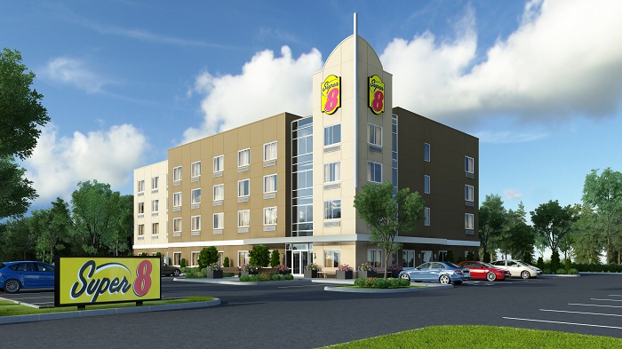
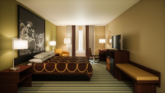
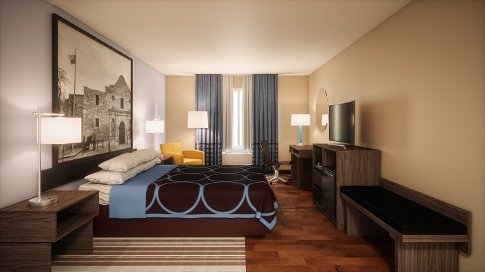
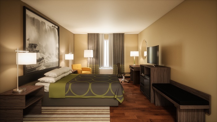
Super 8 – See You On the Road

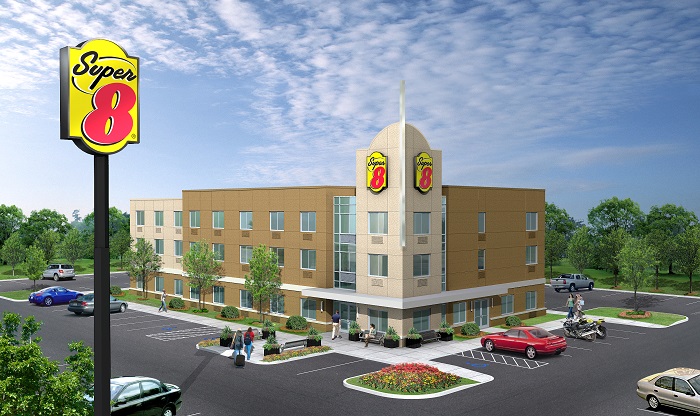
Ron Rivett and Dennis Brown created the new Super 8 Motel corporation with each of them owning 50% of the stock in the new company. Super 8 got its iconic name from how much a room used to cost back then, $8.88 which is about $50.00 in today’s money. The first Super 8, with 60 rooms, opened in Aberdeen, South Dakota, in 1974, built near a Holiday Inn with just some drawings made by Rivett as blueprints. The stucco exterior with an English Tudor style was inspired by Rivett’s father-in-law, who was a stucco; the English Tudor style and placing of Super 8’s near Holiday Inns was an established procedure for setting up new Super 8’s for years to come.

Out of all the prototypes I looked at that Wyndham released, these were by far my least favorite by a long shot. I feel like all they really did was take dull, drab and outdated and tweaked it barely. It really feels like these rooms are just more updated versions of old dated rooms. I feel like there could have been more effort put into these rooms. The color pallet in each variation feels too dark and clashes with everything else in the room.  

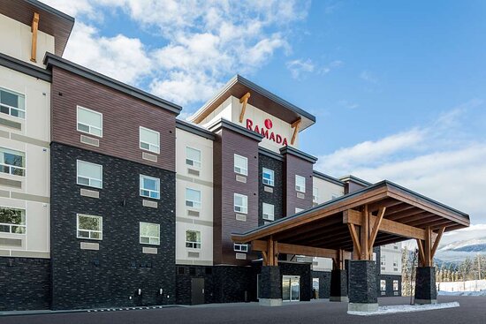
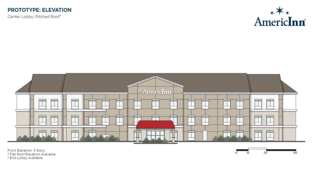
Not only did I feel like the interior was not amazing, the exterior was no better. If you look at the images of what new locations would look like, they look like an office building and not a hotel. While I do give them credit for trying to stand out from the standard box like design, I feel like they could have done a better job of making it look less office-like and more welcoming and relaxing like a hotel should be. Even the lobby also has an office building and commercial like atmosphere to it. Regardless, it is definitely a step in the right direction for the brand over what exists now.    

Ramada

Like many of the brands we already discussed, Ramada also had very humble routes and was innovative from the very start. Founded by Marion W. Isbell with the investment help of Michael Robinson and Del Webb, the brand started in 1953. 

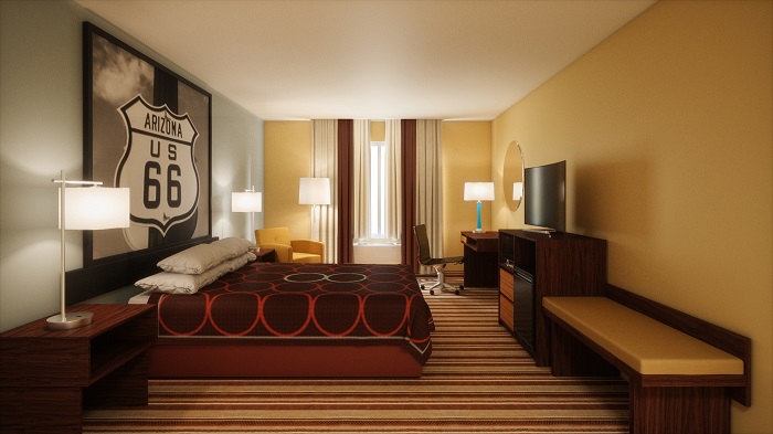
Ramada opened its first hotel, a 60-room facility, on U.S. Route 66 at Flagstaff, Arizona in 1954 and set up its headquarters in Phoenix, Arizona, where the chain built the Sahara Hotel on North 1st Street downtown in 1956 (which later became the Ramada Inn Downtown) and a 300-room Ramada Inn in the 3800 block of East Van Buren in 1958 that would become the chain’s flagship property and headquarters. 

Inspired by rival hotel chain Holiday Inn, Ramada seeked to develop a chain of roadside motor hotels conveniently located along major highways which would provide lodgings with hotel-like quality at near-motel rates plus amenities such as TV, air conditioning, swimming pools, and on-premises restaurants.

I always found Ramada an odd brand because it’s so widespread. Some locations have ballrooms, event space and are full service. Those are generally the nicer locations. Have an old school Hilton feel to them. Meanwhile there are also the select service locations that are just dumpy roadside motels. 

One thing I find interesting about Ramada is how much nicer the locations are in Europe, Canada and Asia. It just speaks volumes of where the brand currently is and what it hopes to be. Overall, I find the rooms are pretty much copy and paste from the Days Inn prototype. For Days, it works all the colors and the design. I think here it’s just too similar to Days. Also the design for Days Inn works since that is a select service/economy brand whereas Ramada is more of a full service midscale brand. I think Ramada is trying to be something it’s not. It’s trying to become like a Hilton, Marriott or IGH brand which it will never come close to.

AmericInn

The AmericInn Franchise was founded by Jim Graves, and the first location opened in 1984. By 1990, there were more than 20 AmericInn properties located in Minnesota and Wisconsin. In 1994, AmericInn began franchising with the help of Wyman Nelson, an entrepreneur known for expanding the Perkins Restaurant and Bakery chain in the 1960s and 1970s.

Expansion outside the Midwestern United States began in 2000. AmericInn has 240 motels, with more than 80 percent of its locations in the Upper Midwest.

All AmericInn properties include a recreation area with pool and whirlpool, as well as fourteen different types of guest rooms. A complimentary hot breakfast, called “AmericInn Perk,” is also offered at each hotel and includes bacon, eggs, biscuits and gravy, waffles, pastries, cereals, juice, and fruit. Rooms are built with masonry block, sound deadening foam and heavy drywall between rooms, as well as concrete slabs, to minimize noise within rooms.

Wyndham Hotels & Resorts acquired the brand in July 2017.

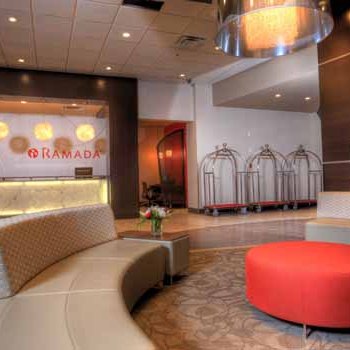
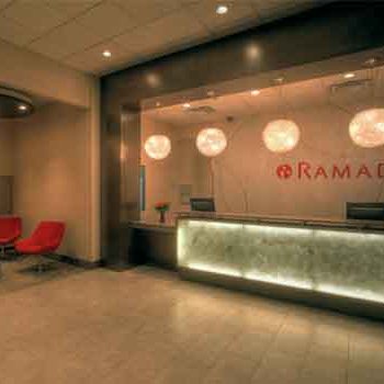
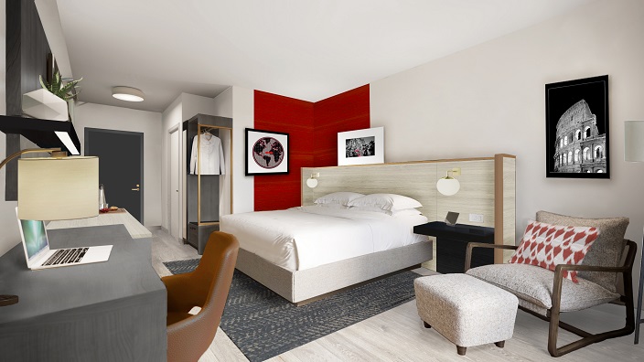
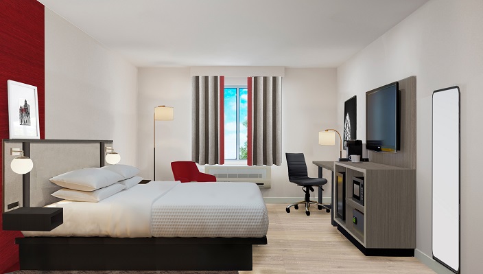
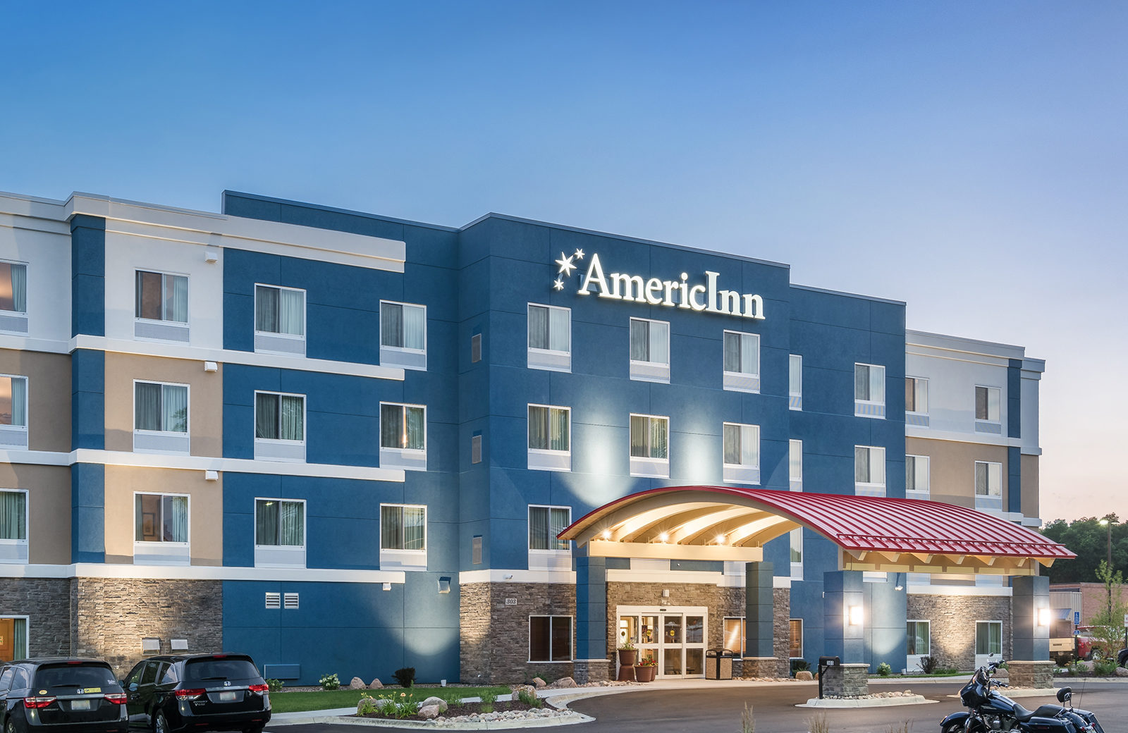
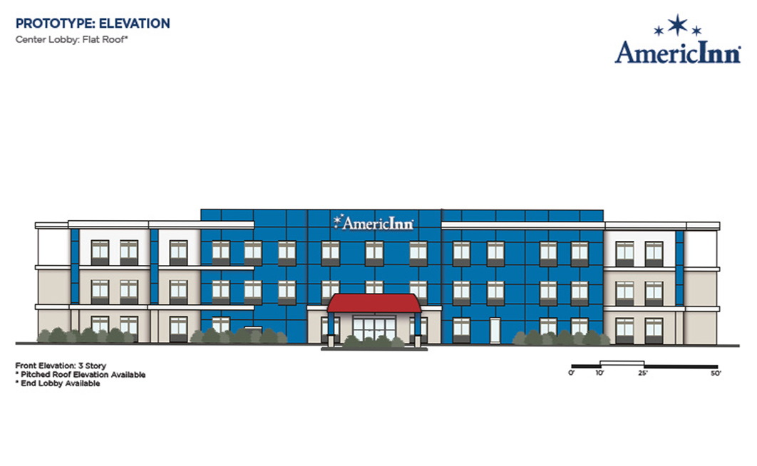
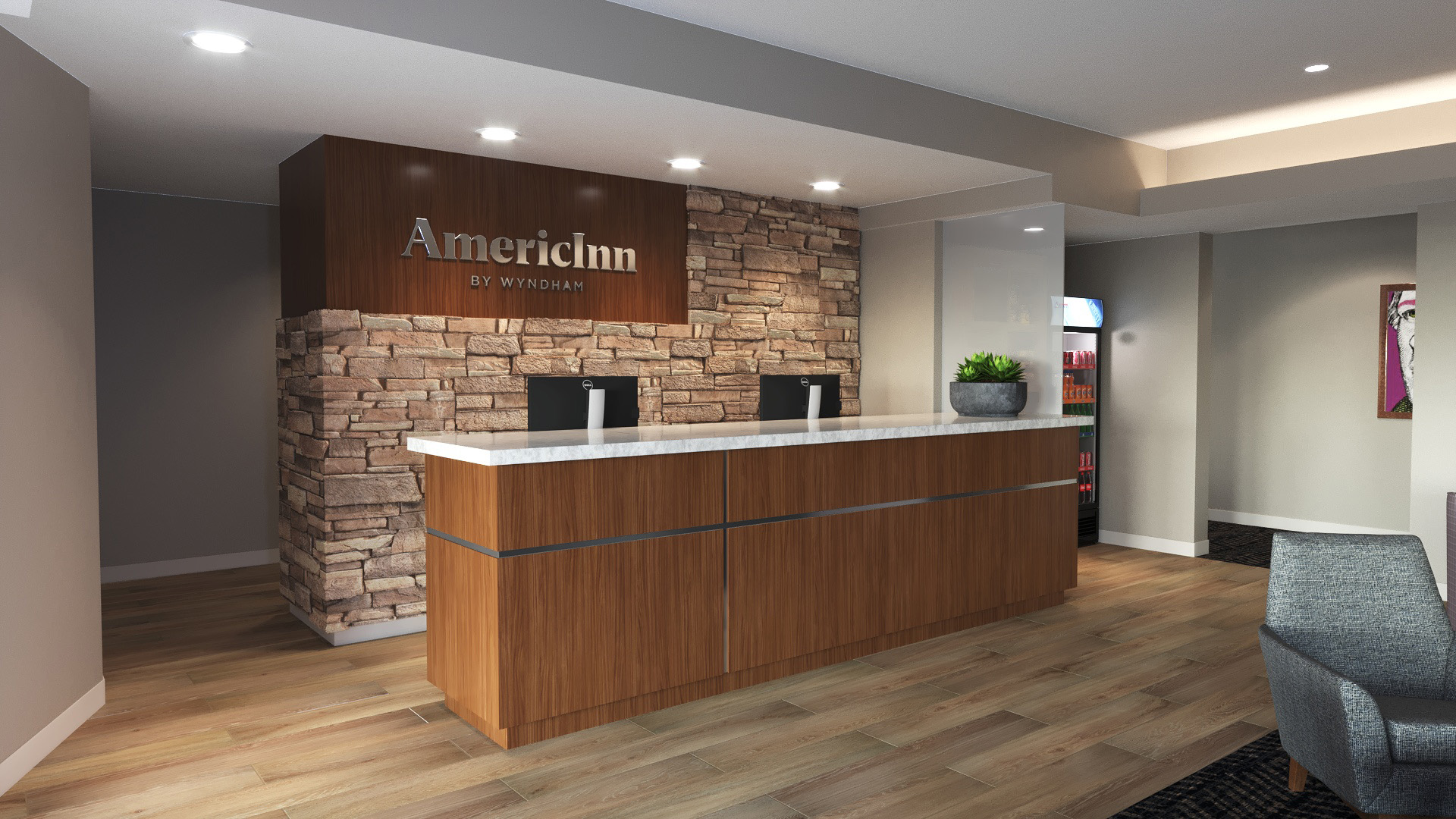
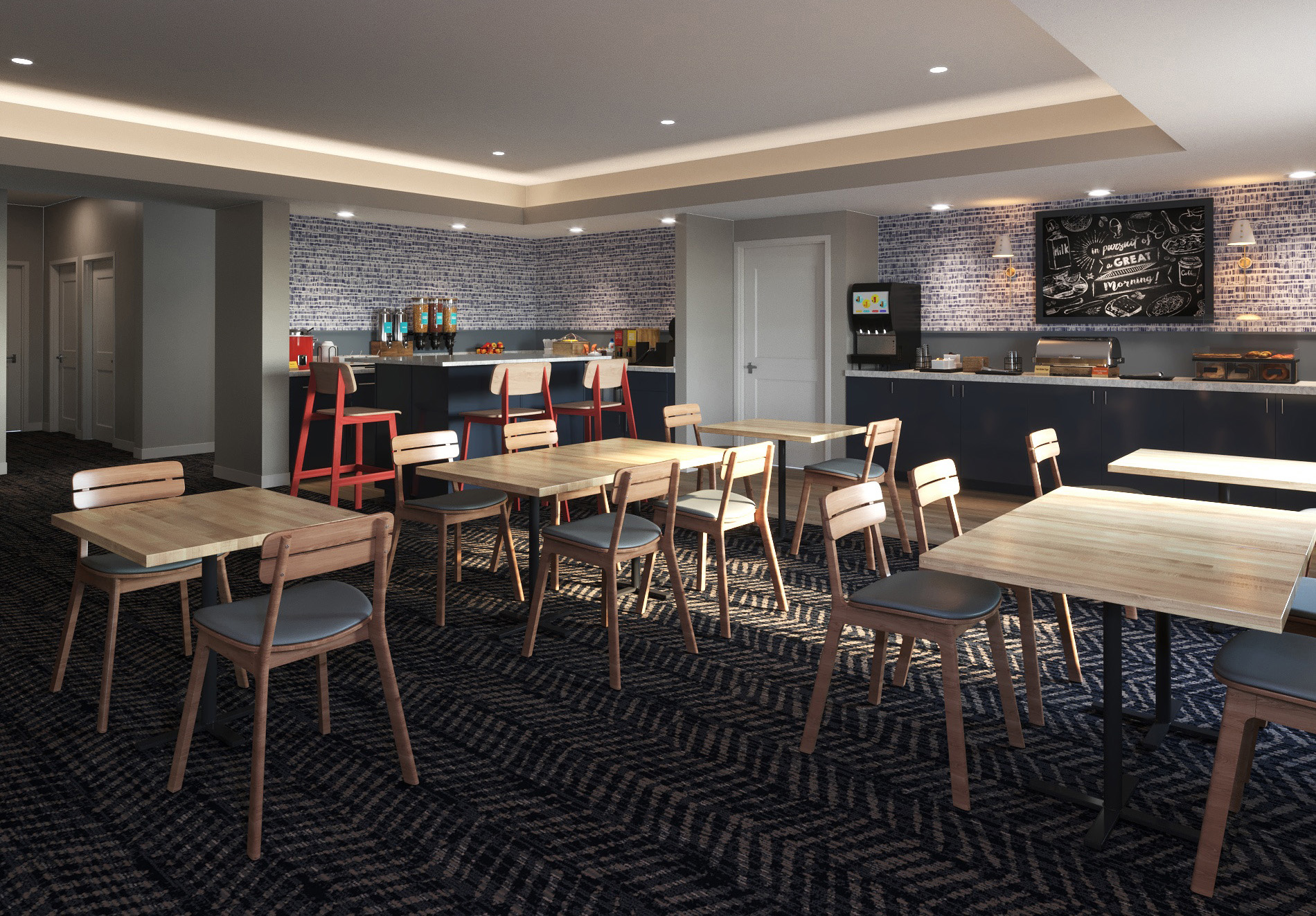
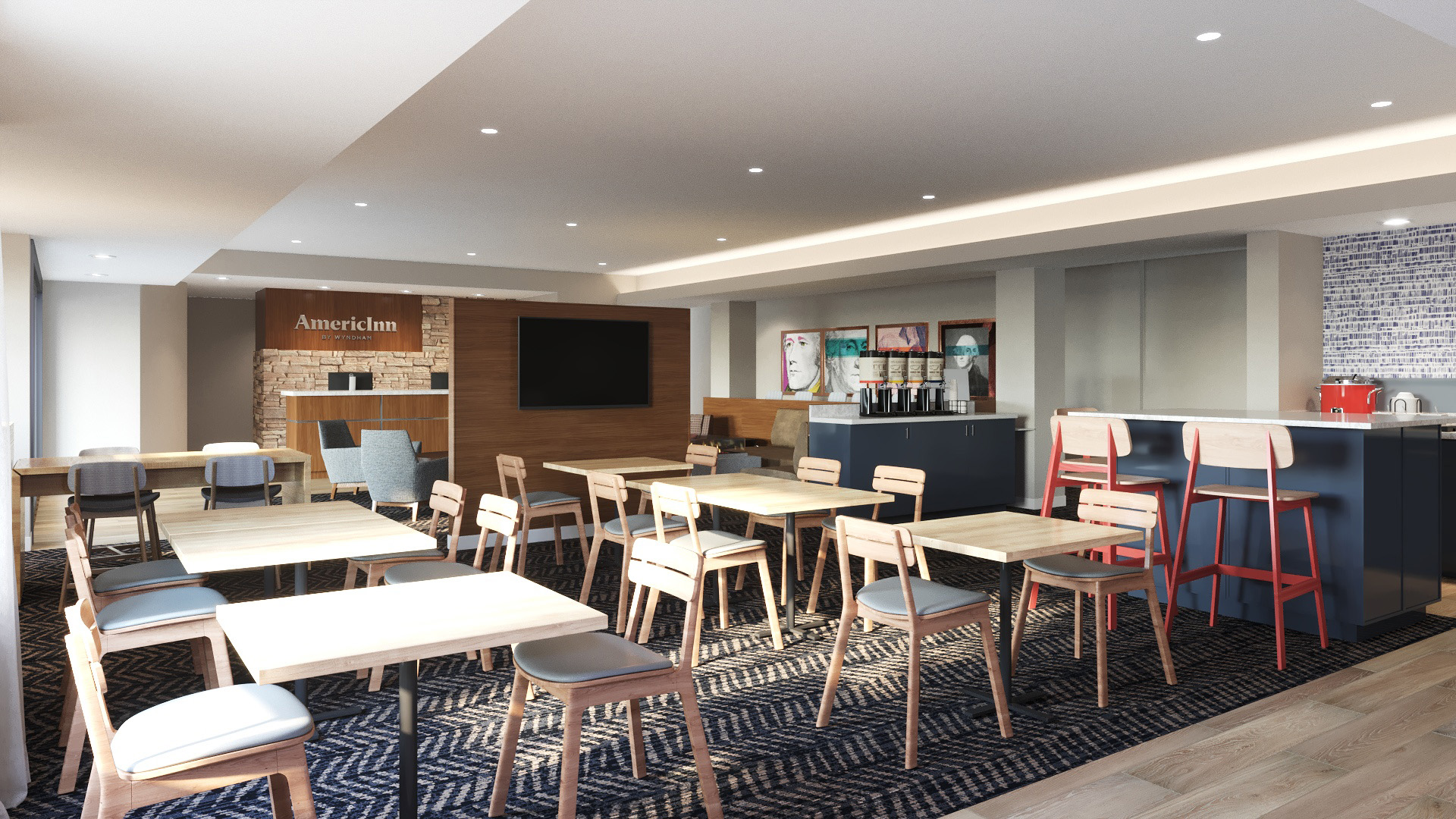
This honestly does not look like a brand Wyndham Hotels. It honestly has more of a Holiday Inn, Hilton or Marriott feel to it. We mentioned throughout this post, the contestant problems Wyndham has across its portfolio from poor cleanliness, bad management, outdated standards and more. AmericInn feels like the total opposite to all these issues. This is honestly the way Wyndham should be going portfolio wide. These rooms are definitely a good way to repair their damaged image from many of their brands without moving too far over to the luxury side. Genius move by the brand acquiring this chain back in 2017.

La Quinta

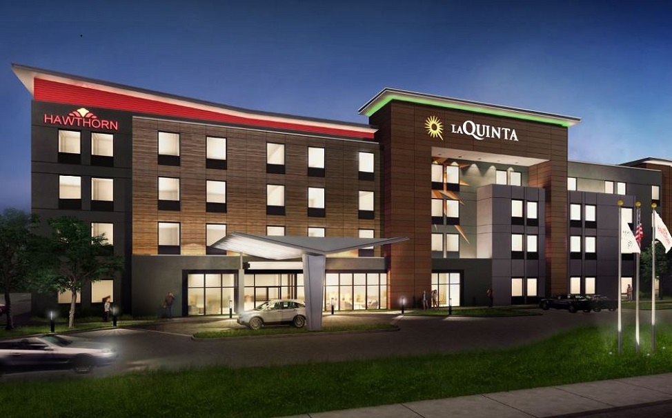
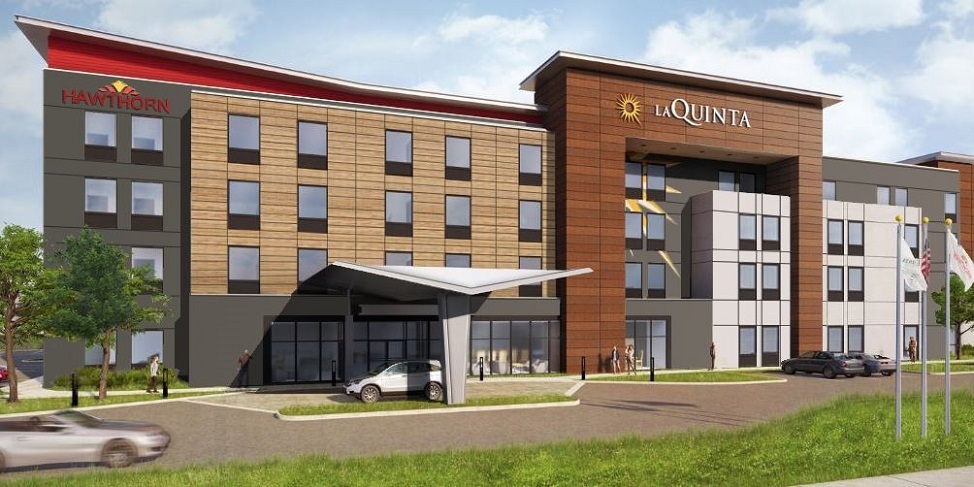
Just like all of these brands, La Quinta also started out as a separate independently owned and operated hotel company. The brand got its start in 1968 from a pair of brothers Sam and Phil Barshop. However unlike most of these brands, where many locations are poorly run, not clean or maintained, La Quinta has actually been setting the standards for new Wyndham brands and renovations. The brand is actually looked at as one of their top brands and is often compared to a Hilton or Marriott brand. Think about that for a second, most of the brands we have talked about, are not even remotely close to or comparable to Hilton or Marriott. This brand actually did such a good job, it’s now even helping the brands up their game and up their standards. 

The brand has also been so successful that it is now beginning to be used in dual branded hotel prototypes. A dual branded hotel comprises two similar hotels from the same brand family – such as a Residence Inn and Moxy by Marriott – in a single building. The brands share the same back of house areas and oftentimes share common areas.

Sadly, it is very difficult to find many development plans, images or renderings for the rooms that are publicly available. However on Wyndham’s franchising site, there are images showing what current locations look like.

https://development.wyndhamhotels.com/brand/la-quinta/

Overall, this is honestly Wyndham’s best and strongest brand they currently have in their portfolio. I would honestly love for all of their brands to get on La Quinta’s level. I think if Wyndham got their economy and mid-scale brands to this level, they could easily compete much better with the top hotel companies like Marriott, Hilton or IGH.

Final Thoughts

With Wyndham scrambling to play catch up to the competition, I think these new prototypes and standards will go a long way to improving all the brands and the experiences guests will have. 

Will these prototypes be enough though? I honestly don’t think so since Wydnham has such lax standards as it is. Many locations are poorly run and not maintained so in locations like this, I think this would just be a waste of time. You can make a hotel look as nice as you’d like but it won’t hide the problems of the hotel as maintenance wise or management wise. In locations like that, it’ll just look nice for a few months to a few years before it is back to where it is. However, in locations where management is good and the ownership cares, these upgrades can definitely go a long way. I honestly think Wyndham needs to step it up and follow in La Quinta’s footsteps since that is honestly their best brand (of course not including the luxury brands or resorts). 

What do you think of Wyndham Hotels and these new prototypes? Will these new changes convenience you to stay at a Wyndham Brand? Let us know your thoughts down below.